

A colorful controversy

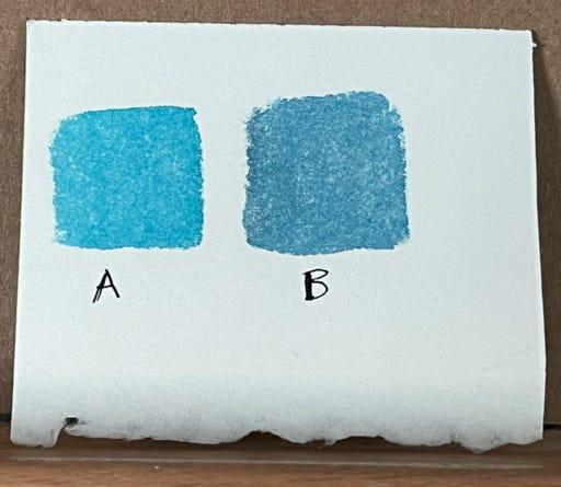
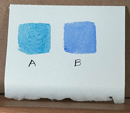
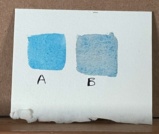
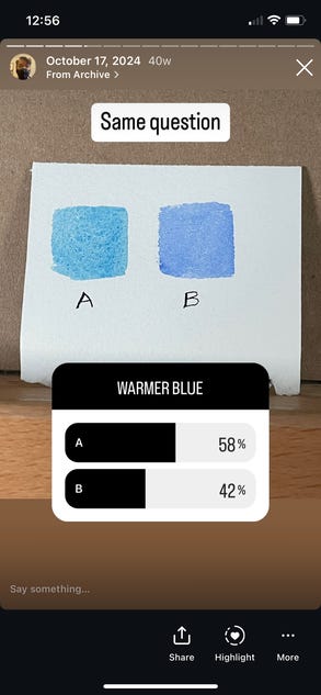
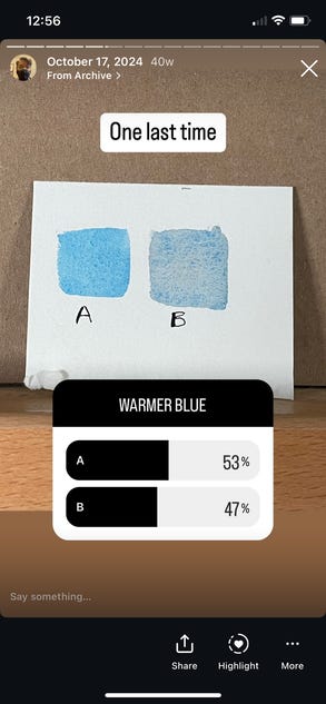
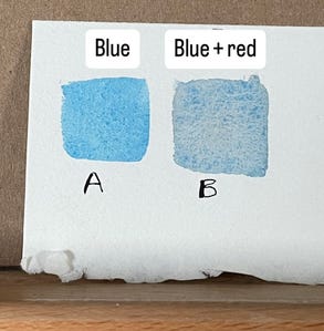
Here are three different images of blues. For each image, decide which blue you think is the warmer blue before moving on.
Story time
Every Wednesday, I work with a local Minnesota artist who helps me improve my watercolor skills. One day, he was giving me some advice on my painting, and he said: "The sky needs to be a warm blue, so use ultramarine." This surprised me because I've always thought of ultramarine as a cool blue.
So I conducted a poll on Instagram. I posted the same three images as above, and asked people to identify the warmer blue, just like I asked you.
The results surprised me. They were almost evenly 50/50!
Results
Lets look at the results:
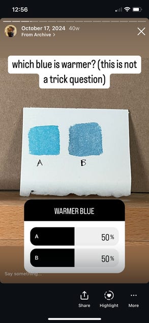
Personally, I’d pick B, A, A. I was surprised at how split the crowd was. A couple of art friends messaged me, also surprised, and questioning whether they knew anything about art at all. Because as artists, it is so obvious what the warm blue is! Except as it turns out, it isn’t.
Here’s the explanation: in each case, the blue on the right is the redder blue.
Controversy!!
I did a little Googling and found out this topic is hotly contested. Here's a thread specifically on ultramarine that goes on for 11 pages!
Lots of people saying they think Ultramarine is cool:
I hear artists refer to Ultramarine as a warm blue and Phthalo as a cool blue. To me eyes, when I look at the two colors it seems just the opposite to me
I believe Ultramarine is cool and Pthalo warm.
This thread tries to bring some science into it:
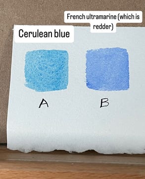
Those closer to yellow-orange/red-orange will be “warmer”, while those closer to blue-green will be “cooler”. This is why Ultramarine Blue (closer to red-orange) is warmer compared to Phathlo Blue (which is a blue-green).
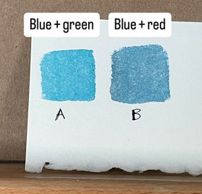
This is similar to what a few art friends told me: Red is a warm color, and green is a cool color, so blue + red = warmer, blue + green = cooler.
Issue solved.
But wait!! Here comes Reddit with a different opinion!
It is a warm blue because it has yellow in it.
Ah, so blue + purple = cooler, blue + yellow = warmer!
blue + red = warmer
blue + yellow = warmer
Both make sense!! Which is right??
Well, you're going to hate this answer. Because not only is there not a right answer, the color wheel is wrong.
The outdated color wheel
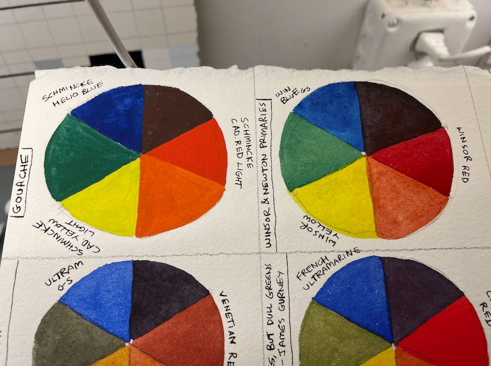
Everyone knows the primaries, right? Red, yellow, and blue are primary colors, and they mix to form the secondary colors. Everyone knows that.
But if that's the case, why are printer cartridges filled with CMYK (Cyan, magenta, yellow, black)? Shouldn't they be RBYK?
Here's the thing: the color wheel was created a long time ago, when artists first figured out they could mix colors to create new colors. At that time, they had limited pigments, and red, yellow, and blue were the best primary colors to use.
We have many more pigments now. Red, yellow, and blue are no longer the best primaries: cyan, magenta, and yellow are. But we still keep teaching kids the wrong color wheel.
And another thing: why do we have the same number of steps between yellow and blue as between yellow and red? I would say yellow to blue is a big shift (warm to cool), whereas yellow and red are much more similar.
Now at this point, some of you are probably saying to yourselves, "I am so happy to be reading this. It's time that someone exposed the arrogance of the color wheel community."
Others of you are probably saying to yourselves, "Wow, I've never read a blog post and been left with less information than I had before. When I started reading this, I didn't care about warm blues and I understood the color wheel. Now I don't understand either."
For all of you in the second group, here is a possible solution to one problem.
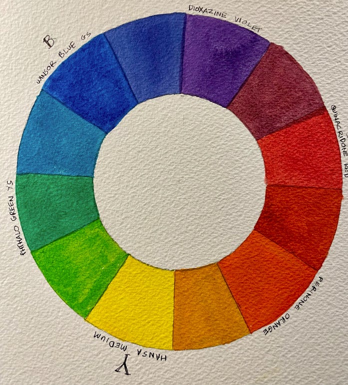
The Munsell color wheel
Some artists have been using the Munsell color wheel instead. This color wheel gives a lot more steps between yellow and blue. We actually have a lot of nuanced blue-green colors, like emerald, teal, etc. and it's useful to have a color wheel that gives space for those.
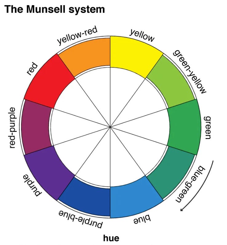
Maybe these extra steps will help being nuance to the warm blues discussion. Or maybe the reality is you cannot analyze color by itself, but only in relation to colors that is near, as some artists think. Maybe all blues can be warm or cool, depending on situation.
Final thoughts
We talked about color temperature. We talked about color wheels. Finally, here is a cool icebreaker for your next meeting: Show people the three images above, and ask them to pick the warmer blue. I guarantee you this will lead to an interesting discussion.
Other interesting things:
